Designing new scripts–a visual addendum
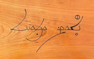
A month ago I wrote about a new script, called Caytu, for the Wolof language of Senegal, the Gambia and Mauritania. In the continued upheaval of moving and resettling the operations of the Endangered Alphabets (a phrase that sounds far grander than the reality deserves) it has taken me longer than I hoped to actually carve something in this new script. But now it is finished, and in the post-dawn light, with the blue jays and red-winged blackbirds calling in the background, I’ve photographed the result.
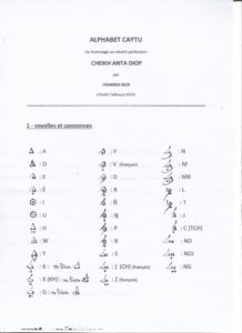
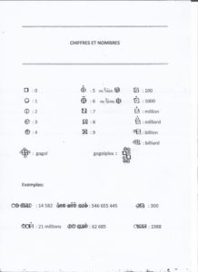
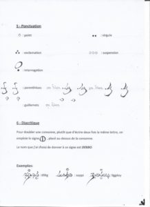
What I find really unusual about this script, authored by Cheikh Talibouya Seck, is the degree of calligraphic conception involved. Some new scripts create letterforms that reflect objects familiar to the user community, and are thus easier to learn; some draw from existing art/craft/aesthetic traditions of their culture and thus seem immediately to be at home. The Caytu script, at least as articulated by its creator, has an expressive flair that refuses to be restrained by the need to fit every character into a neat little Unicode square. There may be a simpler version in the future, but for now I’m celebrating the birth with all the visual fanfare it deserves.
This piece of text says, in Wolof, sama làkk, or “my tongue”–which is, after all, what we are all about.
This post is sponsored by our friends at Typotheque, Letterjuice, and Solidarity of Unbridled Labor.