
Designing Endangered Scripts, Part IV: Avani Lakhotia
Welcome to the fourth monthly Endangered Alphabets feature about calligraphy and type design–in indigenous and minority writing systems.
Here’s the point. If a script exists only in historical documents, engravings, and inscriptions, it is all too easy to assume it is no longer in use, and the culture that created it has also been lost.
But if that script can still be seen, and what’s more, if it can be seen in new, interesting and creative forms, it’s a sign of life, energy, passion, commitment. It not only shows that unfamiliar script to the world in striking and memorable ways, it shows the user community that their traditional writing is still alive, and they have not been forgotten. Of course, communities also feel connected to their scripts because they are deeply familiar, so a designer or calligrapher has to walk a fine line between ancient and modern!
My aim with this monthly feature is to present the work of calligraphers and type designers who are bringing imagination and energy to endangered alphabets, by researching, understanding and acknowledging their traditions, but also adding the expressiveness and individuality that is one of the features of a living script.
This month’s type designer is Avani Lakhotia, who is originally from Gangtok, in the state of Sikkim in India. She is currently a student at Anglia Ruskin University, doing her Masters in Typography and Graphic Design, and has been creating a new font for the Rong language, also known as Lepcha.
I have always been interested in languages and scripts. My mother tongue is Hindi, but I mainly speak in English.
In January 2018 I was doing some research on endangered languages listed by UNESCO and the Language Endangerment project by Google. Lepcha/Rong was on the list, and it stood out to me because it is an endangered language that has its own script, and because I am from Gangtok, Sikkim.
Every culture has its own literature–words related to culture, food items, dress, ornaments, rituals, flora and fauna–which get lost when the script and language are not used anymore. This is what was happening to the Lepcha community: they were losing their history and culture because of the lack of importance given to the script and language.
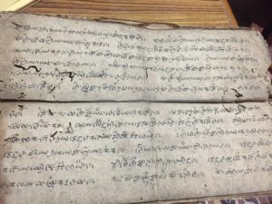
I started by doing primary and secondary research, visiting Dzongu in Sikkim and Kalimpong, in West Bengal [a neighboring state in India]. I also read books, articles and research papers to understand the recorded history of the script and the previous work that has been done.
After my research, the brief I created for myself was to create an effective display font to help in preserving the endangered script. This would also help to improve means of communication amongst the Lepcha community.
I wanted to focus on two reasons in particular why the language and script are endangered: that no economic value is attached to the script, and the lack of knowledge and tools to use the script for communication purposes.
I started creating iterations, keeping my brief in mind and then sending my iterations to the Lepcha community as well as interacting with people who have created fonts before. After which I started digitizing it again, getting continuous feedback from the community as well as my professors.
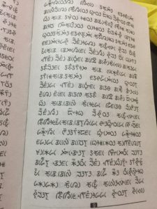
As the script and language were not something that I knew before I began this project, the other hurdles involved actually learning and understanding how each letter is written, from where it starts and where it ends, which line is created first and which one follows. This was important as it the helped understand how each alphabet is written, and the anatomy of the script.
Though for my initial exploration I experimented with multiple tools and grids both traditional and modern, for the final design I decided to go with a fusion. The inspiration for this font came from fonts that have been classified as modern, like Didot and Bodoni.
The reason I chose this style was because it is a mix between old style types and contemporary style. I wanted this as the Lepcha fonts that have been developed before have only used old school/calligraphic style. This modern approach will give the script a new look but not so different as the people are used to seeing the script written in a particular style. This revolutionary Roman style also highlights the unique and royal beauty of the Lepcha people as they call themselves the children of God. It can be used to give an elegant feel to any posters, publication, and signage.
The next challenge I faced was when I took the work back to the community. Though it was very well accepted by the younger generation, the older generation were not very happy because they are used to the script being in a particular manner and believed that the font would confuse the children as to how to write the script–and they believed that only one font should exist. This a challenge I am still working with, by highlighting the use of the font and through presenting it and taking feedback from as many people as I can. 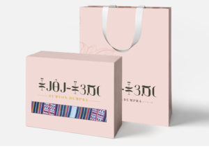
Just by creating a font, I am not actually solving the problem. So the next step focused on creating packaging, branding, school and editorial material to show the community how the script and font can be used for economic purposes.
Though the work was overall accepted and looked at as a positive development, it did ruffle some feathers, which I want to look at positively. As this particularly highlights growth and will encourage me to keep working on the font correcting and developing it further. 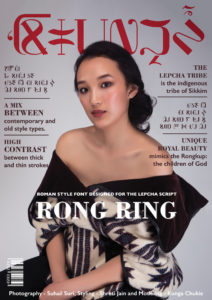
This post is sponsored by our friends at Typotheque, Letterjuice, and Solidarity of Unbridled Labor.

September 13, 2020 @ 11:30 am
हेल्लो मोंडो